BLOG
MAN ONE X PANTONE
Every year Pantone announces it's color of the year to a global audience of eager fashion designers, interior decorators, brands, designers, and basically anyone who deals with color in their perspective fields. Pantone reached out and asked if I would participate in helping them with the early December launch for the color of the year. Of course I said yes!
This year was a first on many levels for starters there would be 2 colors of the year not one for 2016. Named Rose Quartz and Serenity I was asked to bring my creativity to the table. So using Venice Beach as my back drop I created a signature "Man One" graff style focusing on the pastel hues at hand.
That day the sky decided to be in agreement and mimicked the colors I was working with. Wow! Couldn't have asked for a better result. I also created some bespoke Pantone inspired spray can labels just to add that extra touch. Thousands of international Instagram views and comments later, I say it was a successful launch!
Man One signature spray can series for Pantone. Coming soon??
Getting likes on Pantone's official Instagram account.
The morning after.
Thanks to this collaboration I was featured on a few websites like: LATACO and PFSK
Aside from my mural here in L.A., we (CrewestStudio.com) helped orchestrate other murals in Miami and New York at the same time. Check out the work over there by my crew mates Marka27 & Werc.
Photos: Reggie Reagor © 2015
+++
MUSEUM OF LATIN AMERICAN ART
SOMEWHERE OVER EL ARCO IRIS: CHICANO LANDSCAPES; 1971 - 2015 September 19 through November 15, 2015
I am currently showing at this wonderful group exhibition at MOLAA (Long Beach, CA) curated by Julian Bermudez.
My piece "ALIENATION" 48" x 96" aerosol and acrylic on wood panel. 2015
Courtesy of Castulo de la Rocha/AltaMed Art Collection
MOLAA’s first exhibition to present works solely by Southern California-based Chicano artists, introduces audiences to this unique school of American art through a series of landscapes spanning 40 years. The exhibition features paintings, drawings, photographs, mixed media works and rare studies by artists such as Carlos Almaraz, Yolanda González, Gronk, Wayne Alaniz Healy, Ramses Noriega, Frank Romero, Jamex and Einar de la Torre, John Valadez, Patssi Valdez, Shizu Saldamando, Roberto Gutíerrez, Jose Ramirez, and Ana Serrano. In addition, street artists Man One, Jaime “Germs” Zacarias, Vyal Reyes, and Johnny KMDZ Rodriguez have been invited to create new, original artworks—inspired by some of the works on view in the exhibition—to convey the breadth and relevance of today’s Chicano art.
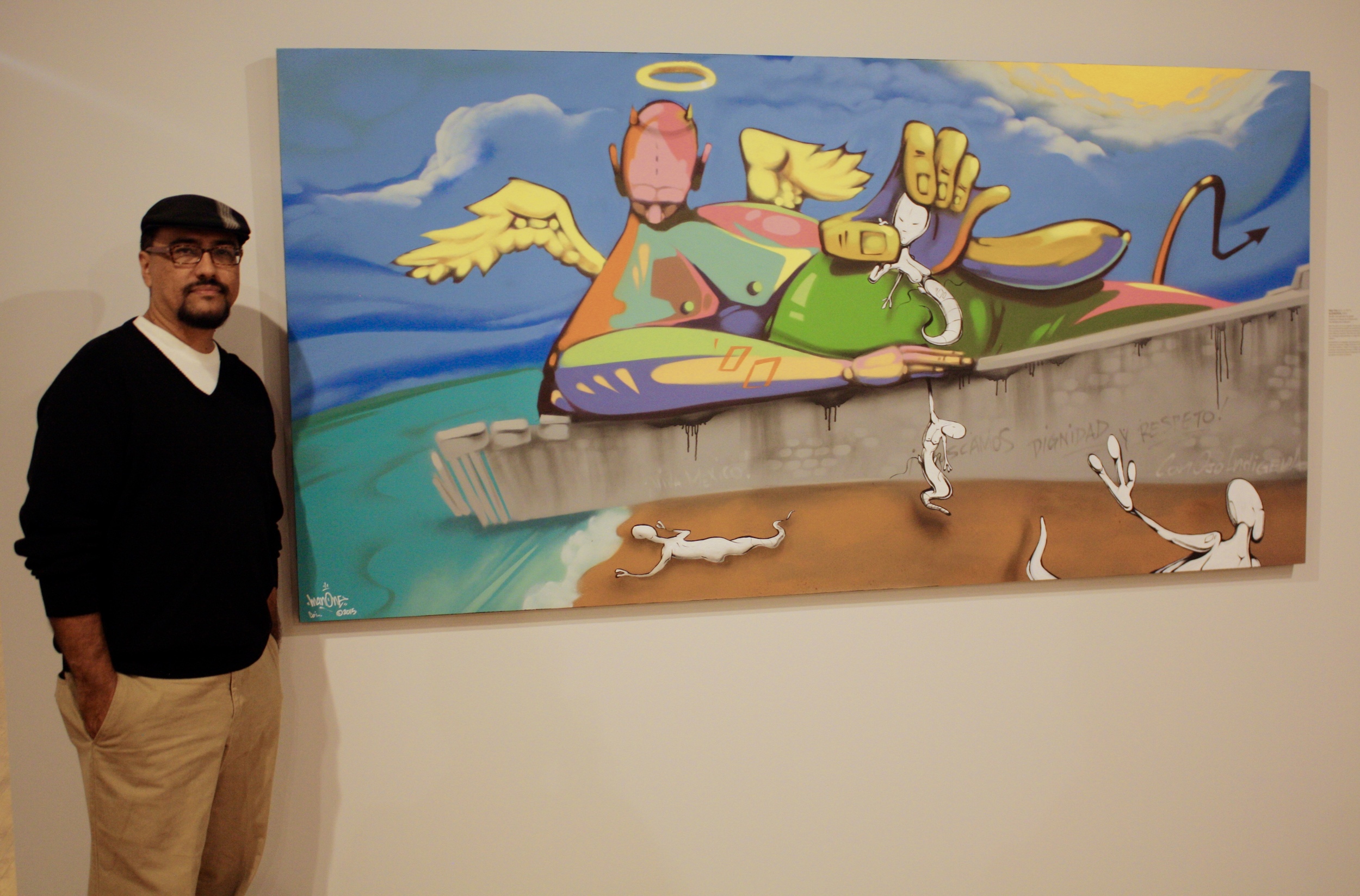
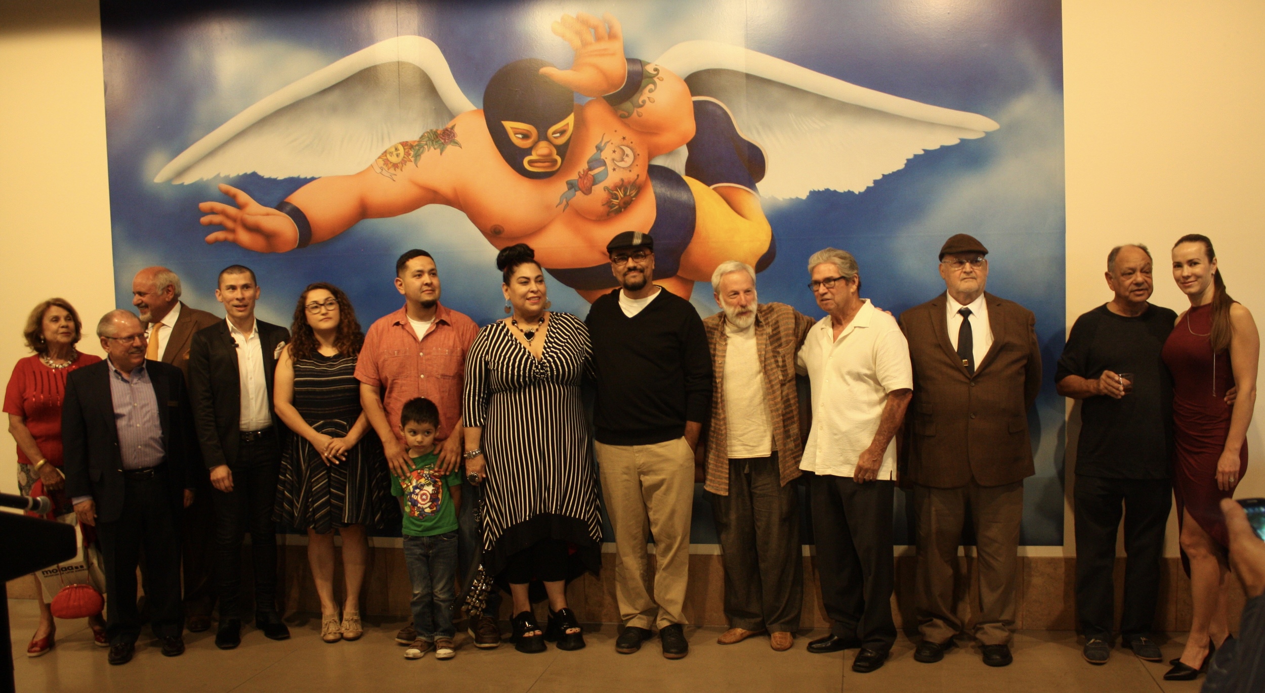
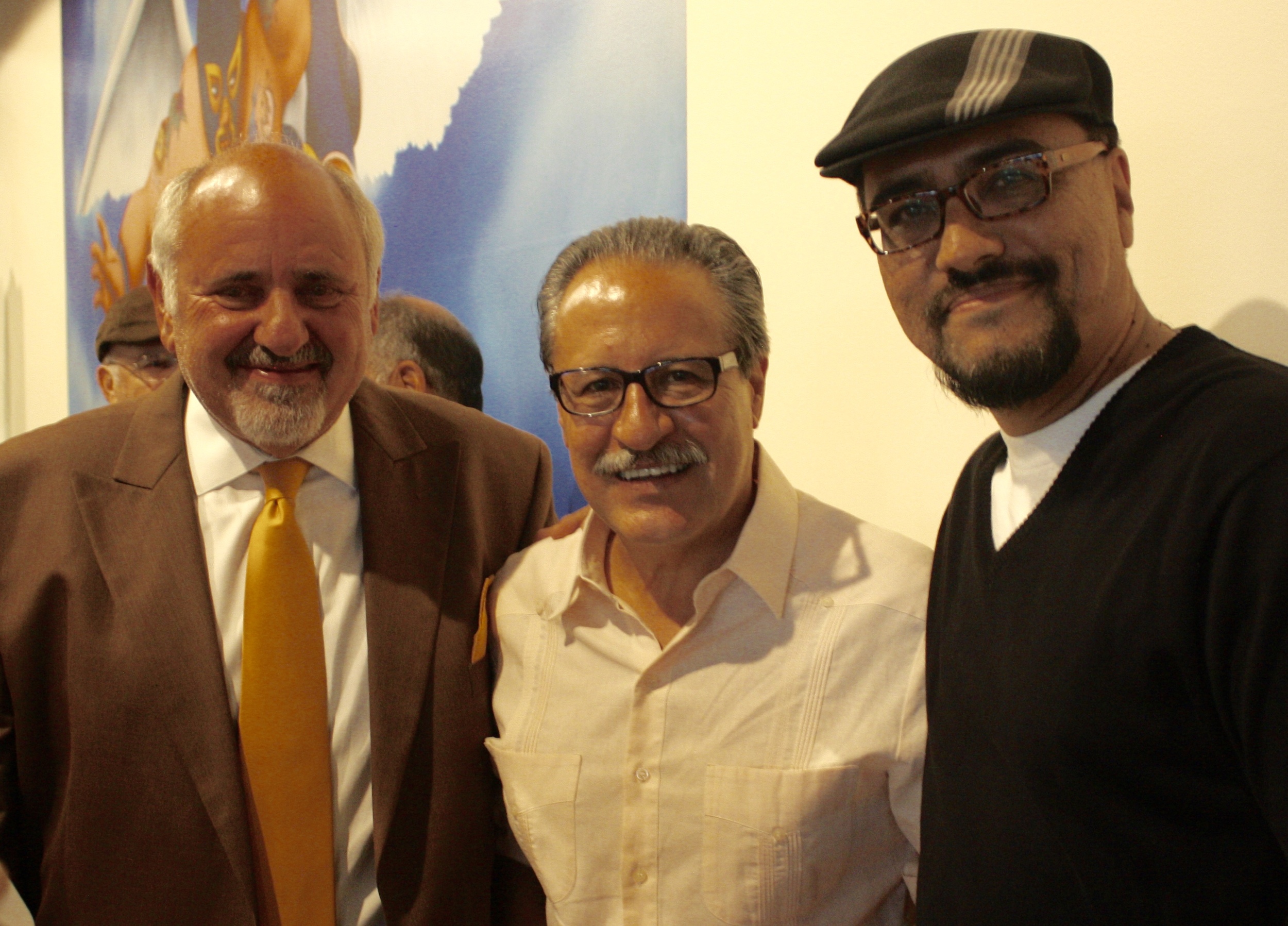
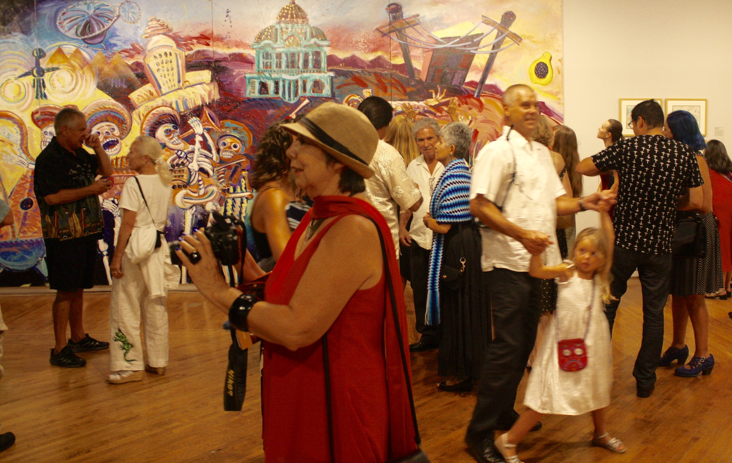
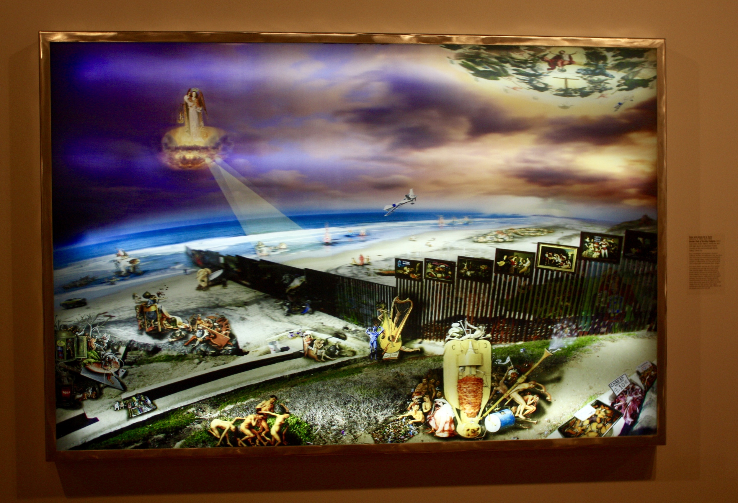

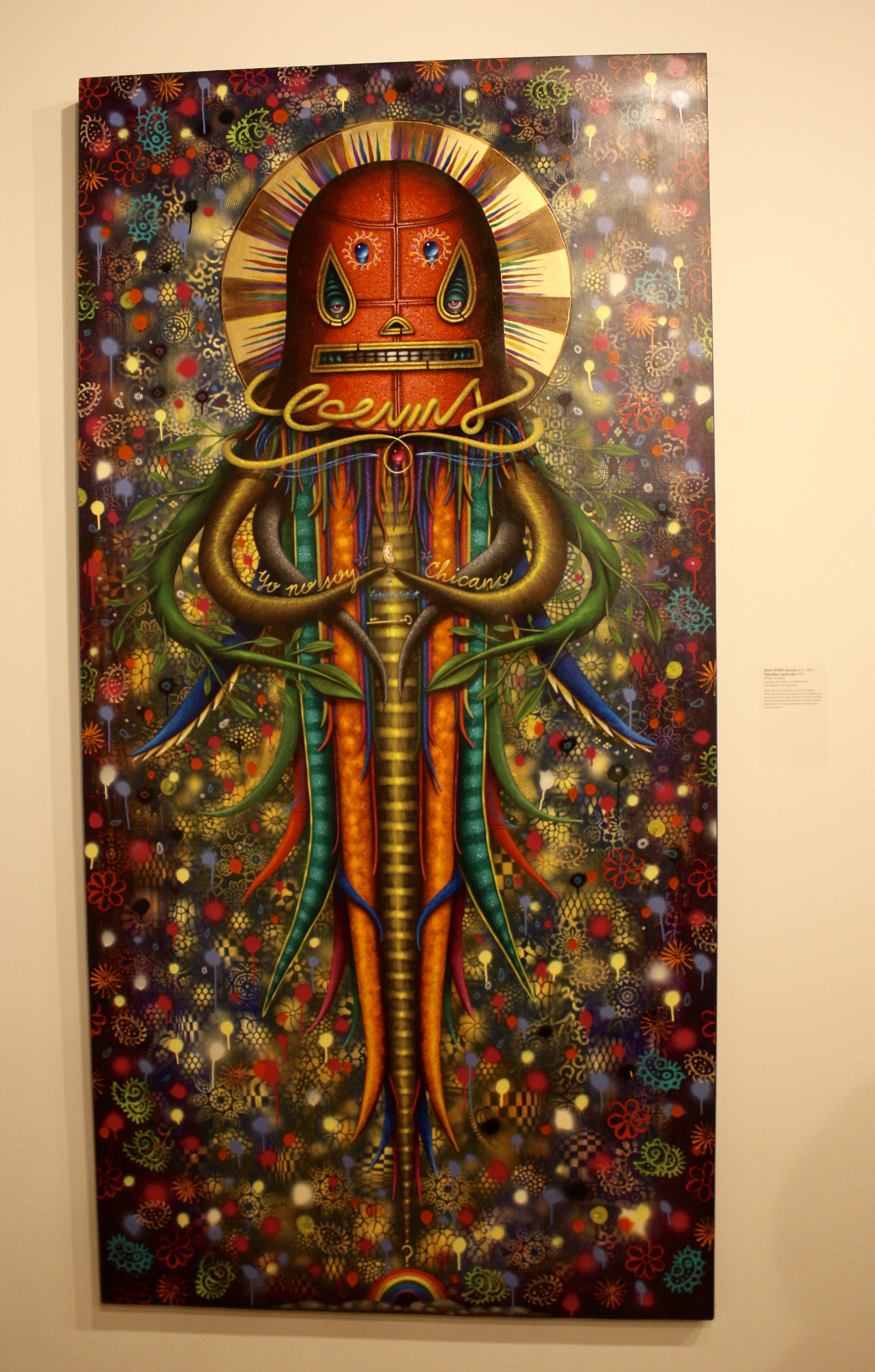
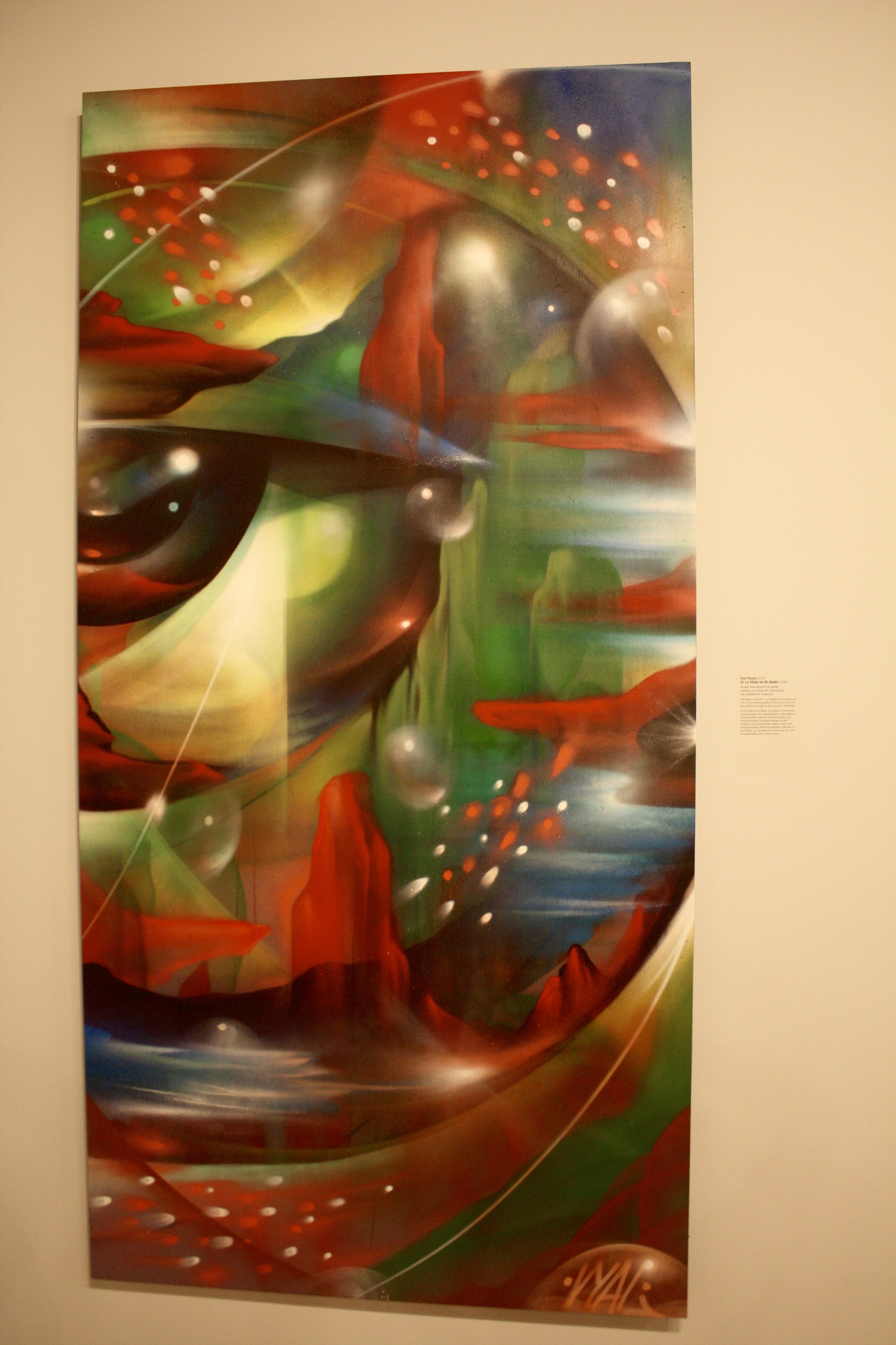
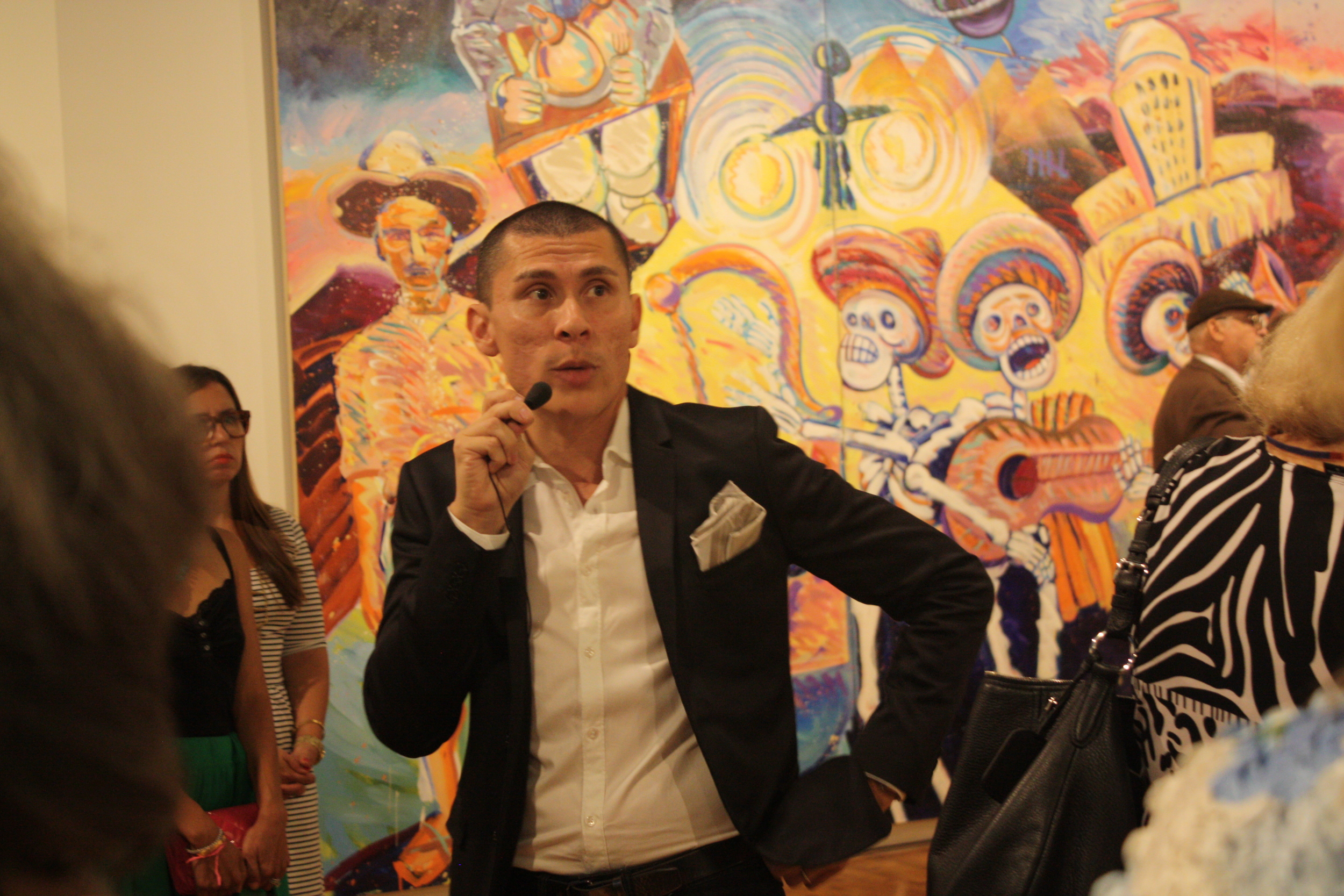
Here are some pics from opening night but there is much more to enjoy in person.
*Extended through January 31st, 2016!
CLASH OF CLANS COMMISSION
I call it "Clans of Insanity!" and its a clash between the American caps versus the German styles. Hope you like!
+++++++++++++++
SPRAY THE CAN WITH ME @ MCA SANTA BARBARA
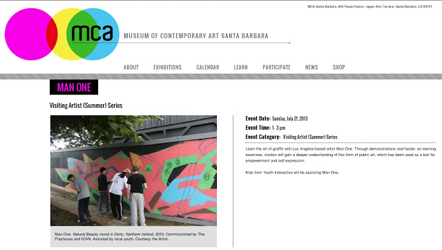
I will be conducting a free workshop "Spray the Can" tomorrow, Sunday July 21 from 1-3pm at Museum of Contemporary Art Santa Barbara.
Stop by as we paint a collaborative mural, create art on spray cans and I might give away some stickers and stuff (while supplies last).
See you tomorrow. Admission is FREE!
The MCA is located at:
653 Paseo Nuevo, Upper Arts Terrace, Santa Barbara, CA 93101.
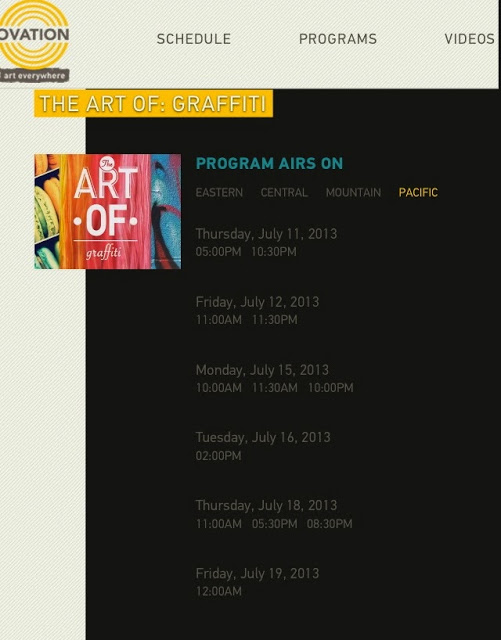
OVATION TV
short video from the episode..
---
I will be one of the featured artists this week on Ovation TV's new show "The Art Of Graffiti"
MEETING OF STYLES MURAL IN GERMANY

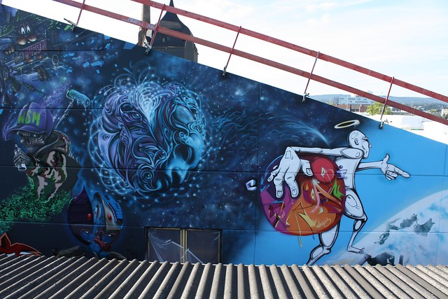
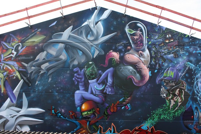
Here are (almost) final shots of the mural we painted in Wiesbaden, Germany. The mural was a dedication to the International Wall Street Meeting Monument and Meeting of Styles in the Schlachtof-Wiesbaden, Germany.
The theme was a Graffiti Universe, here's me working on my Man One World and character!
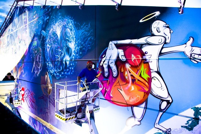
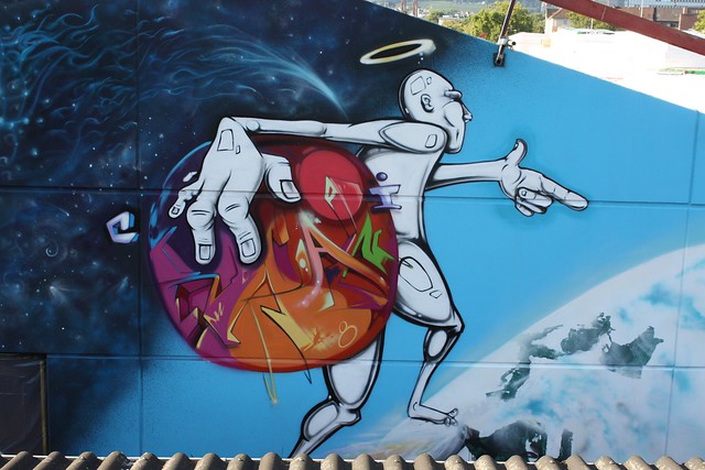
Me and the homie Werc...in our own galaxy!
Middle part of the wall with Mr. Puppet, Made, Totem2, Alien, Just, and a few others...
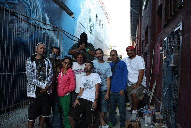
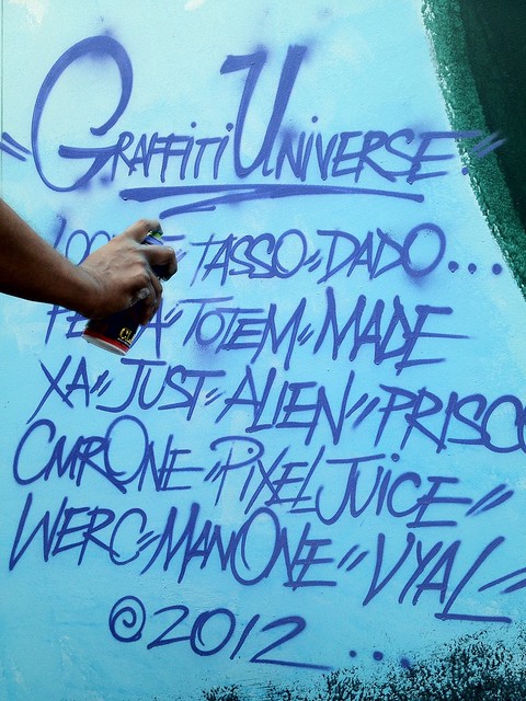
Here's the roll call of who was on the wall:
VYAL, WERC (Los Angeles)
MADE & PEETA ( Padova)
LOOMIT (München)
TASSO ( Meerane)
PIXEL JUICE (Mainz)
RZM (Wiesbaden)
TOTEM2 (Atlanta)
MR. PUPPET (Sweden)
ALIEN & JUSTONE (Venezuela)
PRISCO (Puerto Rico)
and a few other artists.
More pics from Germany on my Flickr album:


