Every year Pantone announces it's color of the year to a global audience of eager fashion designers, interior decorators, brands, designers, and basically anyone who deals with color in their perspective fields. Pantone reached out and asked if I would participate in helping them with the early December launch for the color of the year. Of course I said yes!
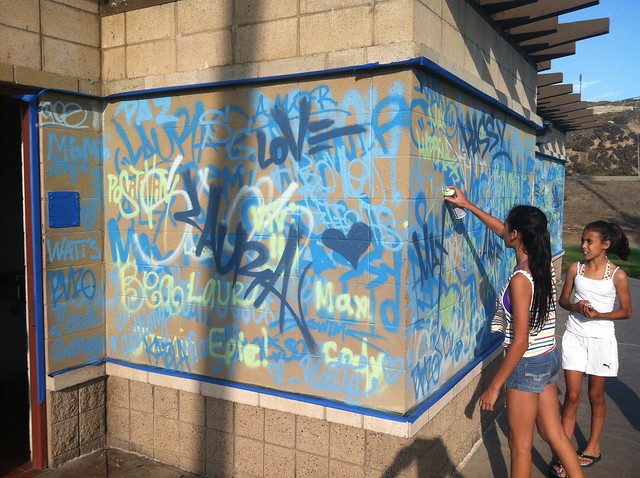
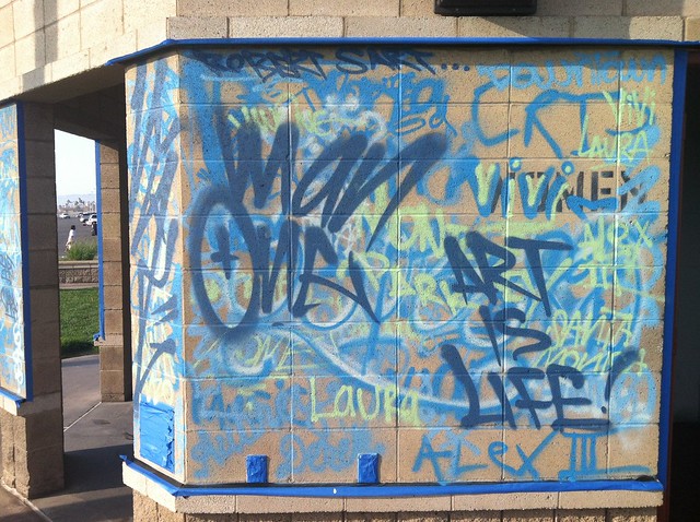
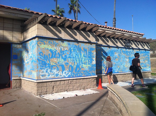
This year was a first on many levels for starters there would be 2 colors of the year not one for 2016. Named Rose Quartz and Serenity I was asked to bring my creativity to the table. So using Venice Beach as my back drop I created a signature "Man One" graff style focusing on the pastel hues at hand.
That day the sky decided to be in agreement and mimicked the colors I was working with. Wow! Couldn't have asked for a better result. I also created some bespoke Pantone inspired spray can labels just to add that extra touch. Thousands of international Instagram views and comments later, I say it was a successful launch!
